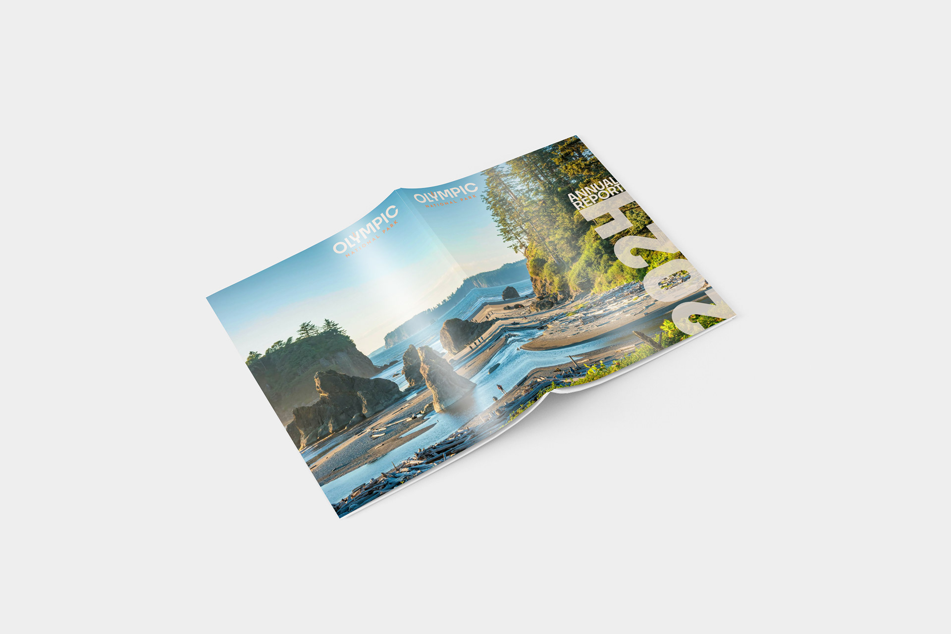
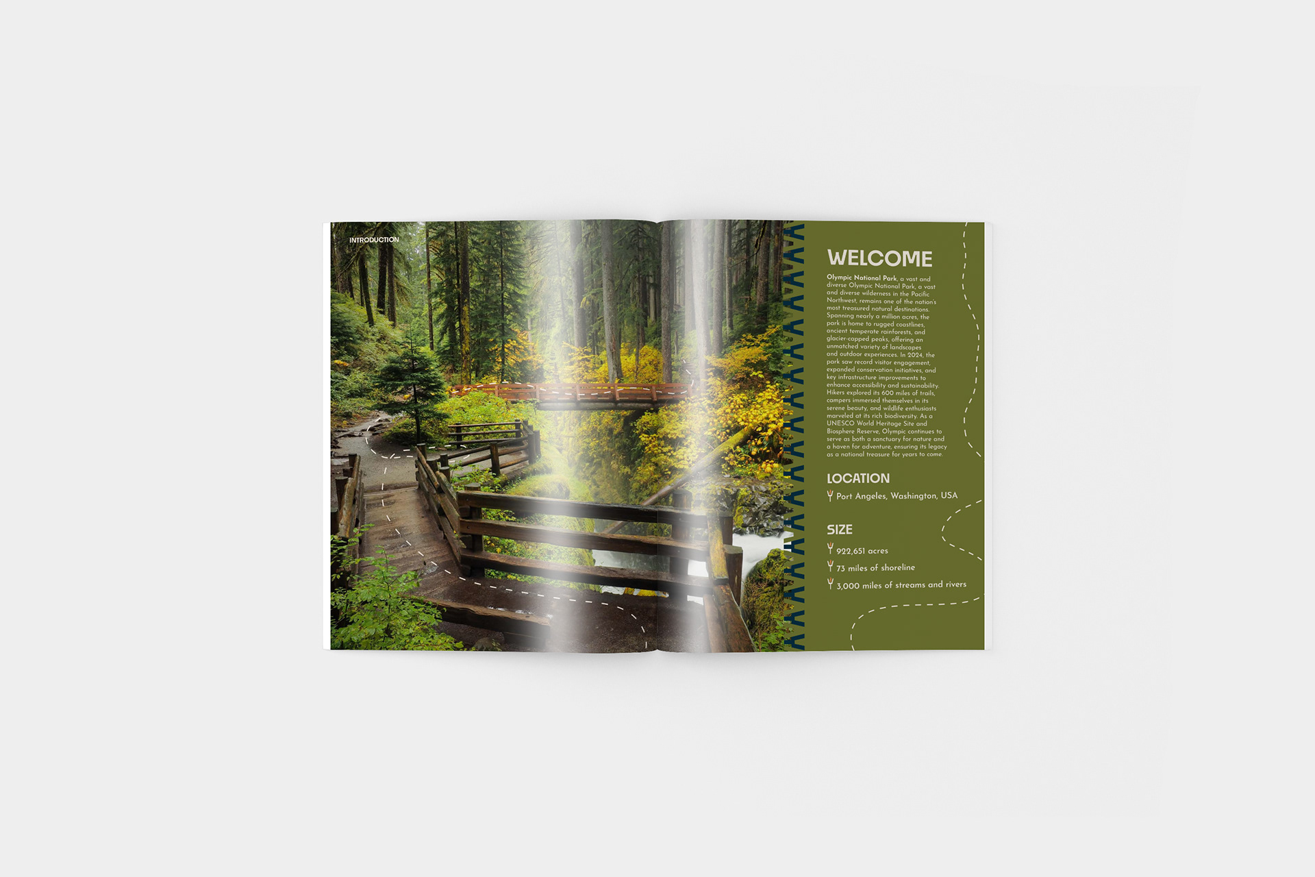
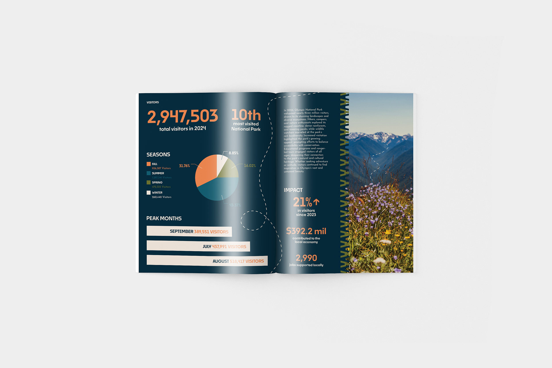
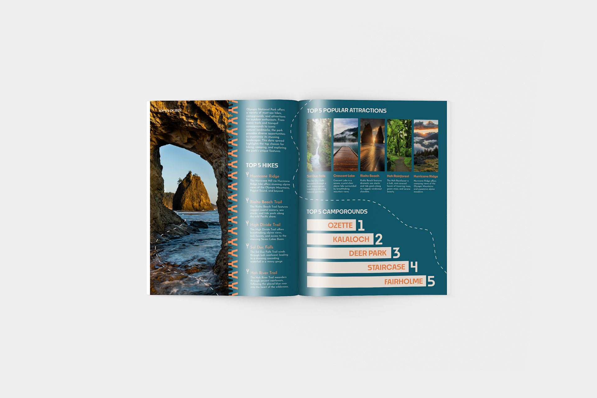
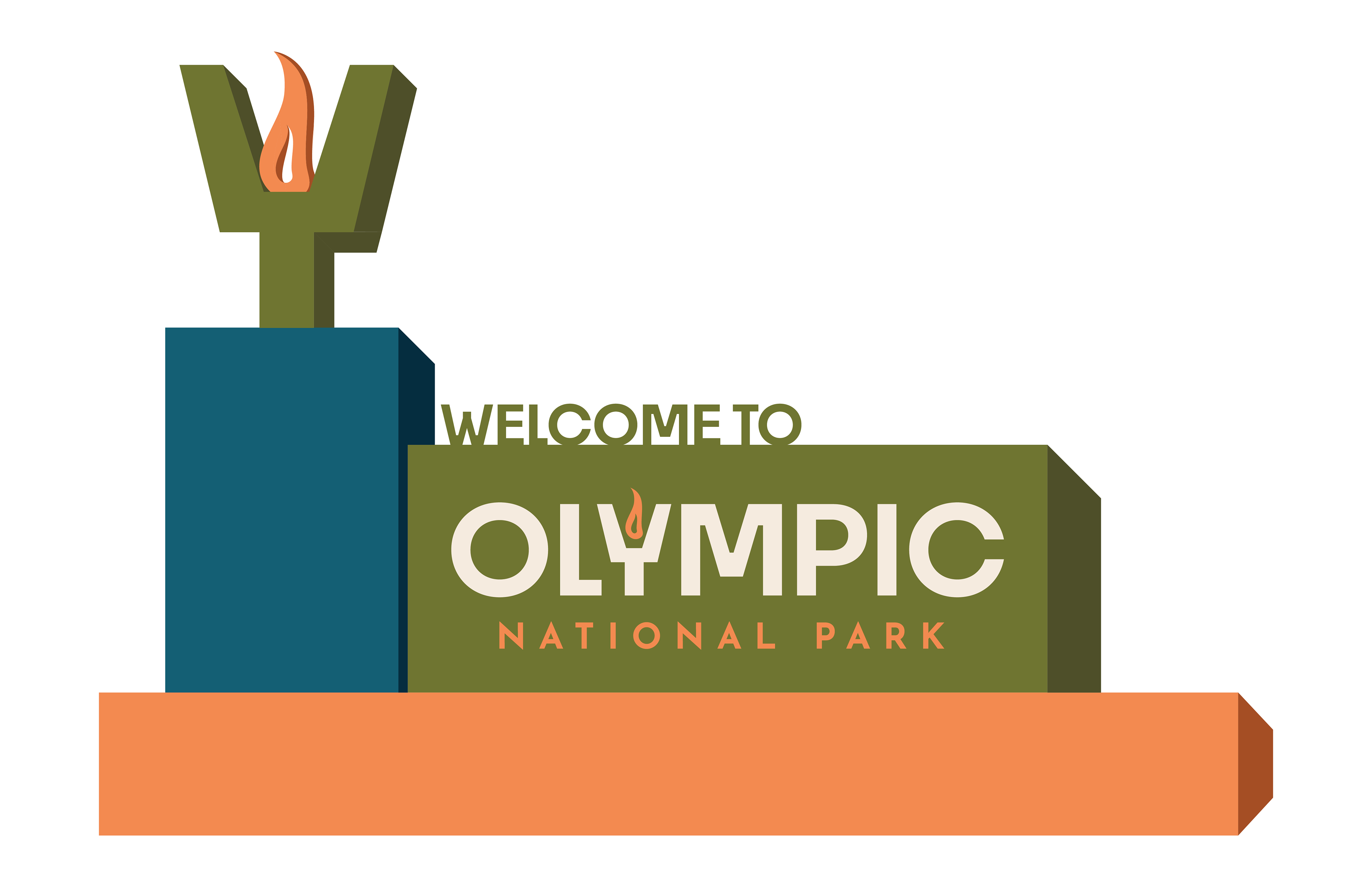
This project reimagines the visual identity of Olympic National Park through the development of a cohesive branding system and annual report. The logo draws inspiration from the park’s name and the symbolism of the Olympic flame, while the color palette reflects the diverse natural ecosystems found throughout the park. The annual report applies this identity through thoughtful layout and visual storytelling, creating a piece that is both informative and visually engaging.
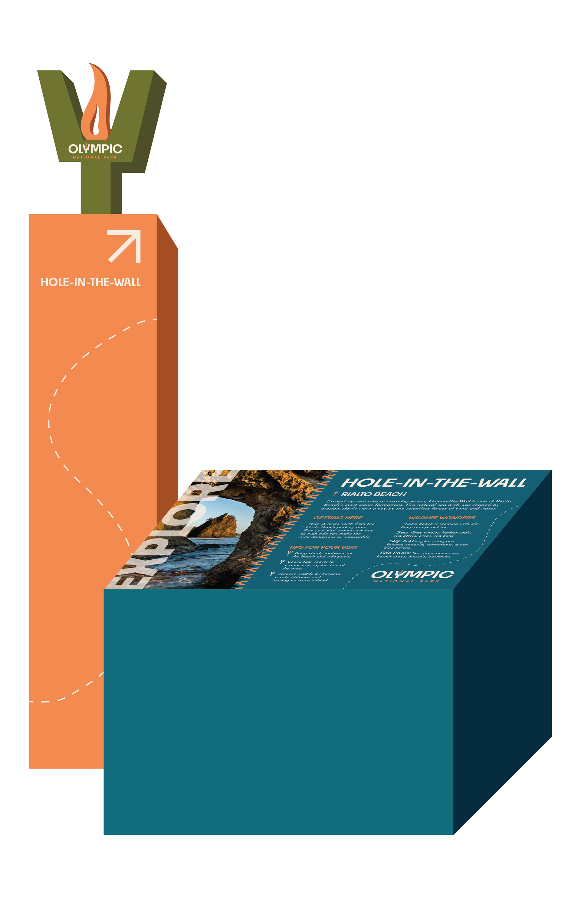
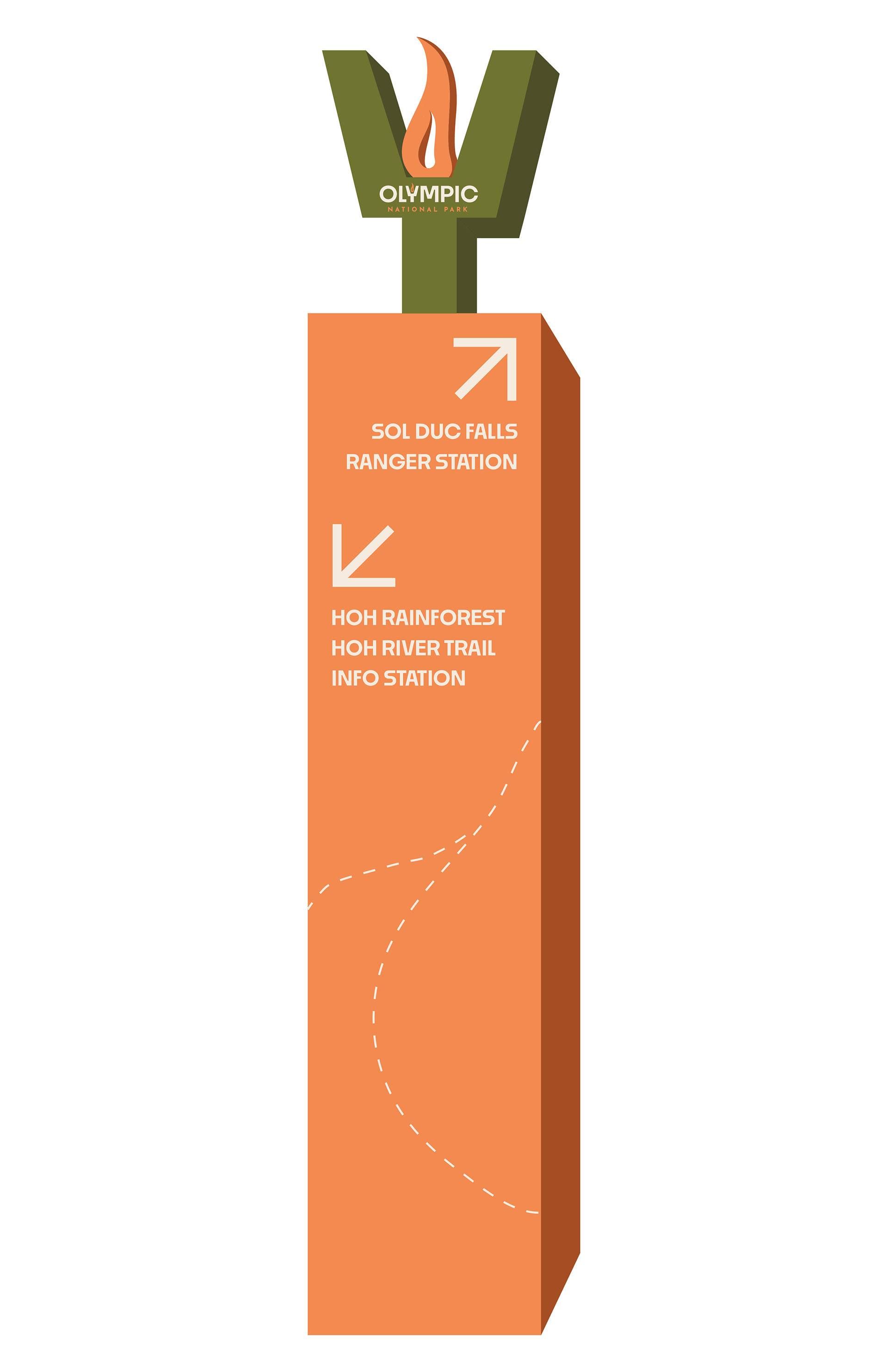
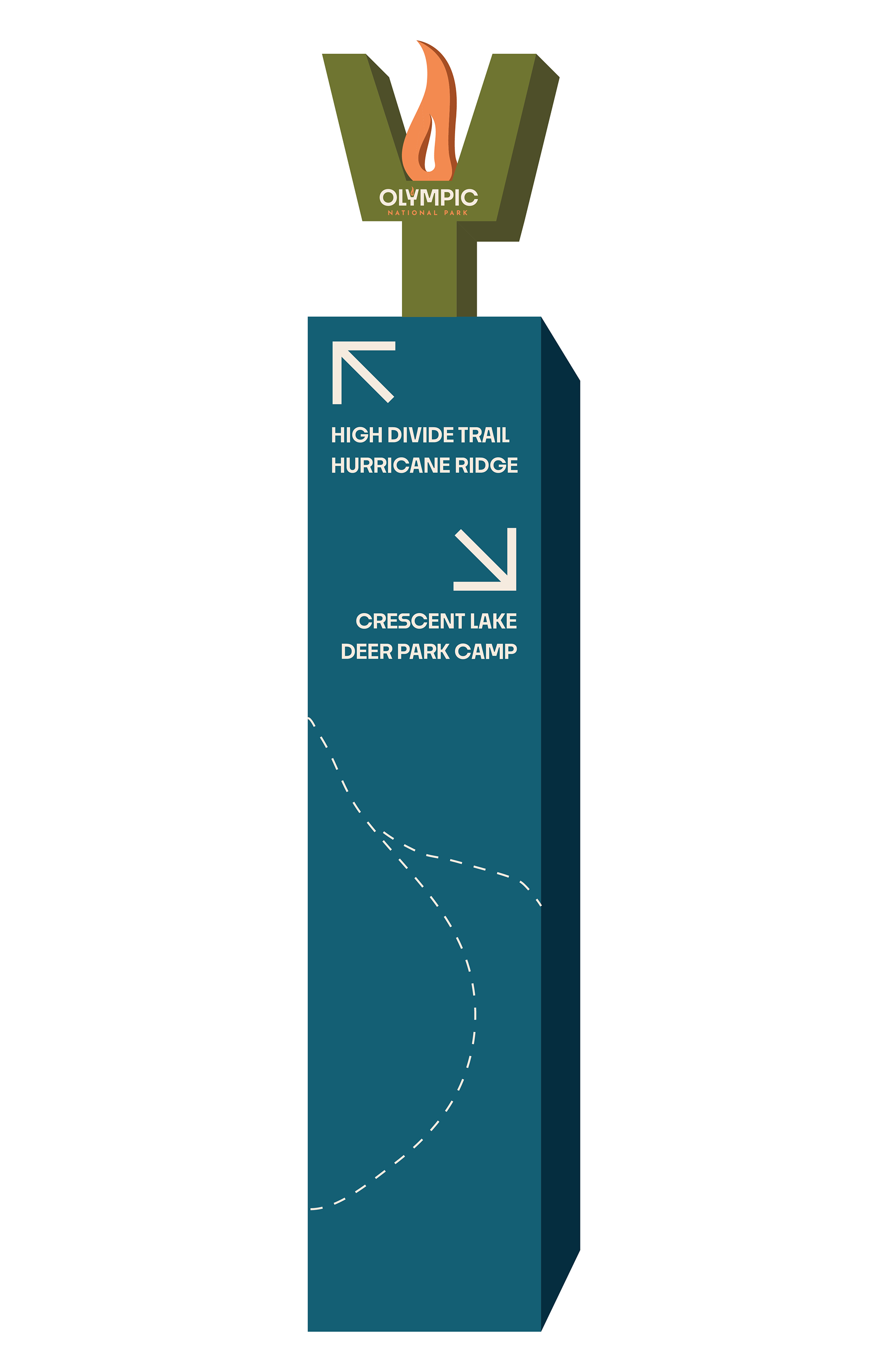
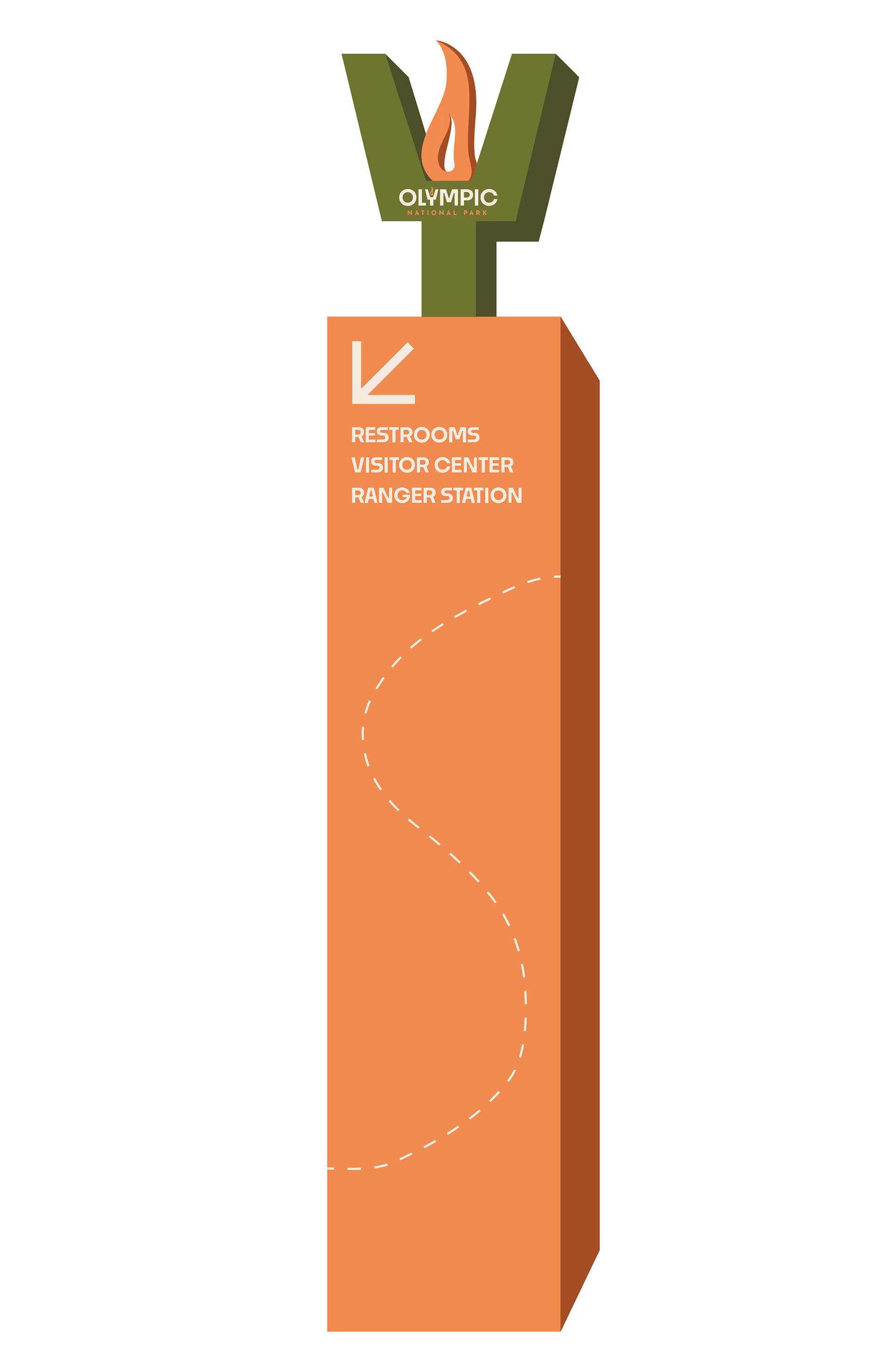
The wayfinding system extends the brand into the physical environment, focusing on clarity, accessibility, and consistency. Designed to guide visitors seamlessly through the park, the system incorporates the established visual language while responding to the natural surroundings. The result is a functional yet cohesive experience that enhances navigation without detracting from the landscape.
Images used in this project are not owned by the designer and are included for conceptual presentation only.